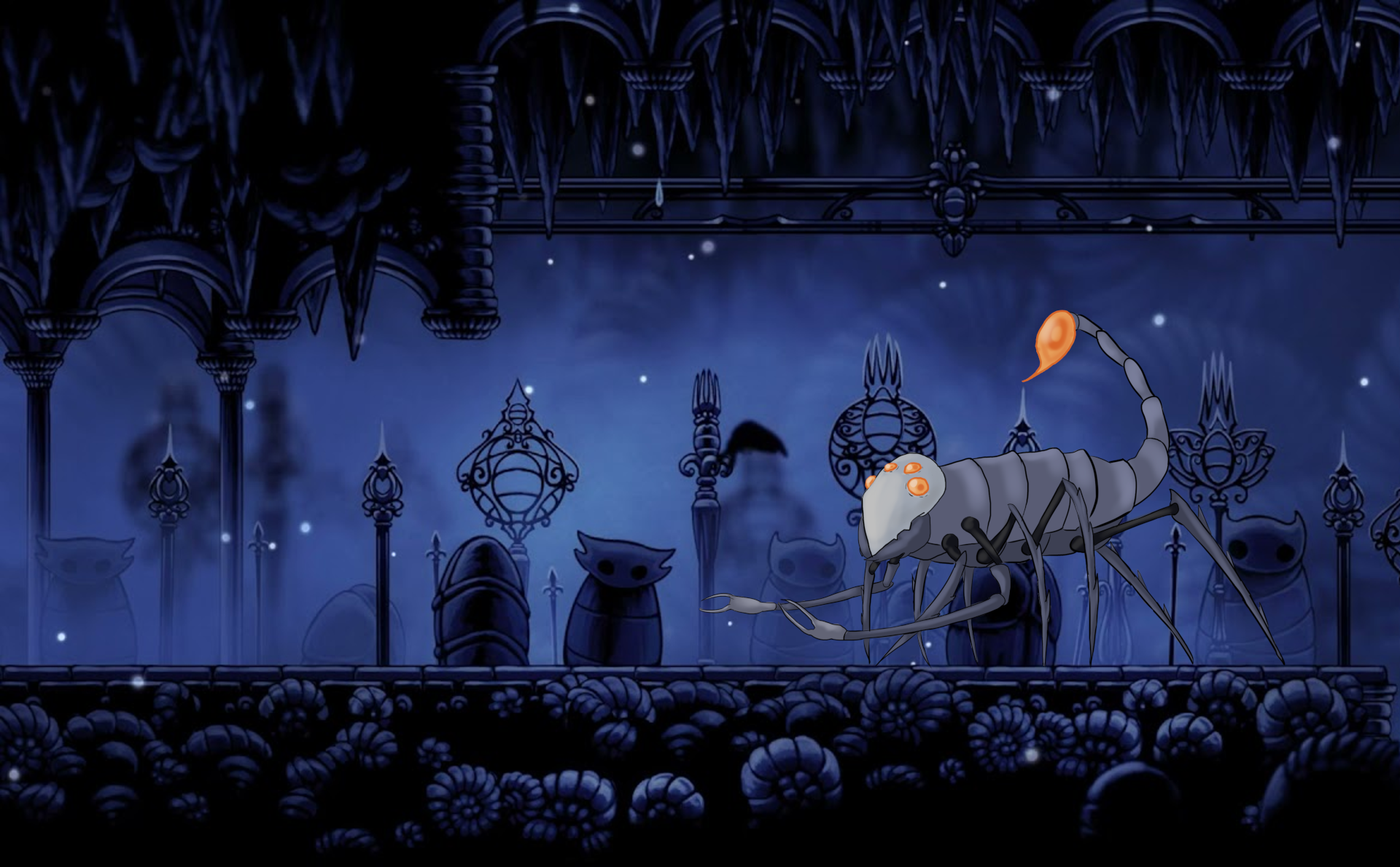
As a challenge to test my ability to replicate the visual style of a property I personally really enjoy I attempted to create an enemy based on the art style of the metroidvania, Hollow Knight. The games enemies are all generally themed around certain insects so I decided to create a design based on a scorpion.

The colour palette of the original game is limited to a series of blue greys and whites with the occasional accent colour to highlight something dangerous. I feel as though I was able to capture the overall essence of the design language but that in comparison to some of the games original assets I could have more heavily leaned into usage of thicker line work to bring the image more in line with the original product.